DatePicker
DatePicker is a combo-like GUI field for selecting a calendar date. It stores a
DateTime value normalized to midnight, supports KSS themes, participates in
Ctrl+wheel content zoom, and exposes its date as a signal property.
Basic Usage
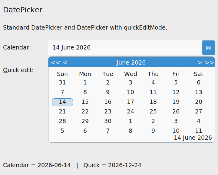
Create a picker with an optional initial DateTime. The popup opens from the field
button and lets the user navigate months and years before selecting a day.
import klyn.binding
import klyn.gui.windows
import klyn.time

picker = DatePicker(DateTime(year=2026, month=6, day=14))

Binding.watch(picker::value, lambda(value as Object): print(picker.value.toString("%Y-%m-%d")))
The dateChanged event is also available when event-style application code is more
appropriate than data binding.
picker.dateChanged += lambda(e as ActionEvent): print(picker.value)Quick Edit Mode
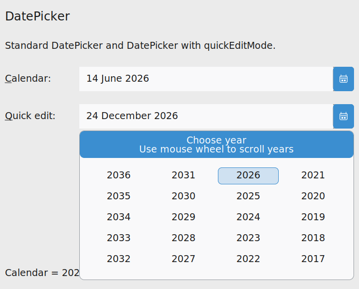
Set quickEditMode to true when the user should enter a date in three
quick choices: year, month, then day. The year page is displayed in reverse columns, and the
mouse wheel scrolls the visible year range.
quick = DatePicker(DateTime(year=2026, month=12, day=24))
quick.quickEditMode = true
Month names are currently rendered in English. Localization can be layered later without changing the widget contract.
Using DatePicker in Forms
DatePicker works well with FormLayout because it behaves like a regular
focusable field. Label buddies and mnemonics work through the same model as text boxes and
combo boxes.
form = FormLayout(14, 16)
root.layout = form

form.addRow("&Date:", DatePicker())
form.addRow("&Fast date:", quick)
Theme and Zoom
Built-in light and dark themes define a dedicated DatePicker selector. The field,
popup, calendar cells, focus outline, and button use the active KSS colors. Runtime content
zoom is applied through the same metrics as other GUI widgets, so Ctrl+wheel scales the field
and popup consistently.
DatePicker {
    background: var(--control-bg);
    background-color-2: var(--accent);
    border-color: var(--control-border);
    color: var(--text);
    selection-color: var(--selection);
}
Run the Sample
The distribution includes a minimal sample with a standard date picker, a quick-edit picker, and a status label pinned at the bottom of the window.
klyn samples/gui/DatePickerSample.knNext Step
Continue with File and Folder Dialogs to let users select filesystem resources without coupling application code to a platform backend.